Jun 232013
Title: Sinister But She Was Happy
Fandom: RAPTURE
Characters: Salmacis
Rating: M (L0 N3 S0 V0 D0)
Warnings: Test-pose nudity in the video. Images are clothed.
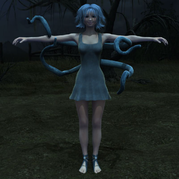
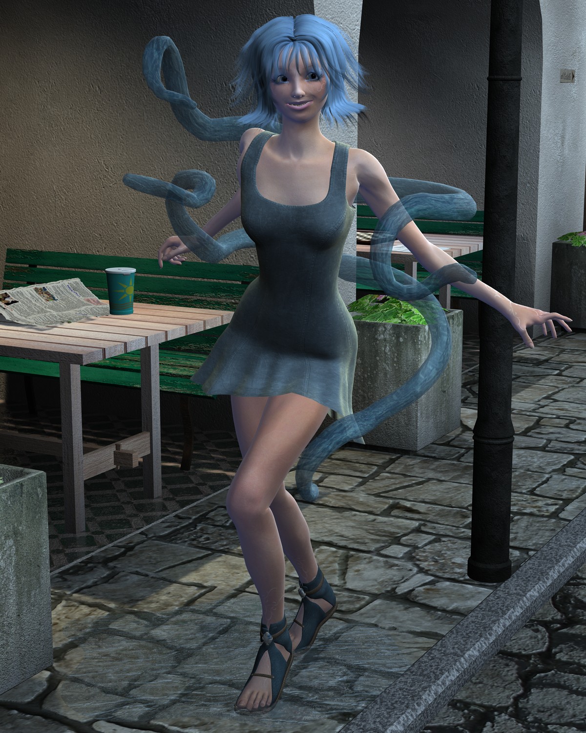
Notes: … like a chandelier festooned with leeches. Seriously, though, I read Salmacis, and I have to go put that on. I completely screwed up her face. Like, horrendously. Like, I'm going to zero out her head and try again, and go for a little less of the huge-eyed anime girl look.Yes, I want her to look subtly wrong, but this isn't even subtle, it's just blatantly horrifying. Two images and a 'making of' video, below the cut.
2013-06-21: Building Salmacis from Penbrydd on Vimeo.


Now, the wonderful thing about Fears is that, of course, everyone can portray them how they want. And the wonderful thing about Salmacis is that her Camper mean she can present herself however she wants. So anything you come up with will work. BUT. Having said that. I'm going to talk a bit about the very specific blue-Camper "design" that Sally developed to appeal to Jordan.
..actually, first of all, I'll start with the eyes, as you've recognized the importance of getting the eyes right. The eyes are usually the best way to know for sure that someone is a Camper. A Camper's eyes are glazed, like they're in a coma (or, in more disguised cases, like they're simply staring out into space). Artists all seem to want to try their own way to portray what these eyes would look like, but I personally think Logic got it absolutely perfect (http://blindrapture.tumblr.com/post/29911316470/drawn-by-logic-a-coloured-in-sketch-of-salmacis a good example is here, the eyes there). See, they don't necessarily look *exactly* glazed, but then again being a Camper isn't exactly being in a coma. There's gonna be an element of stylization.
Whenever I draw anything at all, I always end up drawing Camper. And the way I show anything is a Camper is I give them those eyes, those eyes that Logic gave that Camper. There's just something about the half-open almost judging gaze, I dunno.
SECOND OF ALL. The dress. When I asked Logic to draw Salmacis in a dress for that picture I've linked, she… gave her a very short dress. I do not get this. Logic's giving her longer dresses for future pictures because I've brought this up, but that one portrayal kinda got a lot more artists to draw her that way too and I just EAH
SALMACIS CAN WEAR WHATEVER SHE WANTS BUT I MEAN IT'S JUST NOT THE *STYLE* I'M GOING FOR WITH THE STORY
CHARACTERS CAN HAVE FANCY OUTFITS BUT THEY'RE ULTIMATELY MODEST, THEY REVEAL LITTLE, EVEN DONNIE'S DRESS WAS MEANT TO BE LONG AND REVEAL LITTLE
THESE WERE MEANT TO BE CHARACTERS WHO AREN'T IMMEDIATELY SEXY IN APPEARANCE
BECAUSE I WANTED TO REMOVE THE ASSOCIATION BETWEEN APPEARANCE AND ACTION
And plus I just personally think long dresses are prettier. .w.;;
BUT I should mention my headcanon is that she only wears the dresses for special occasions anyway, to keep up appearances (hohoh, there's that recurring theme), and that usually she's just in whatever old clothing her Camper can fit in.
Somewhat going off of that is the question of footwear. Heels, admittedly, are the one thing I never expected Sally to wear. Logic had her barefooted, Cadet put her in socks (FREAKING ADORABLE). Now, if you're portraying her in the dress, I can see putting her in heels. So I won't complain about that.
Finally, hair. You chose a pretty hairstyle. I've noticed the artists tend to portray her hair as being wetted down. On one hand, I don't actually like EAT always being blatantly associated with water. On the other hand, the wetted-down look is always drawn really appealingly. owo Like, the length of the hair is always not too short and not too long, so it's not obviously wetted-down until you look at the longer parts of it and I dunno! I don't have any point to this paragraph, I'm just talking about how the hair has been portrayed before. I'm happy with the one you chose.
SO YEAH. I don't want it to seem like I'm complaining about, really, anything here. I just figured maybe if I rambled a bit about my intentions and how artists have portrayed things before, it might offer more insight in revising the picture?
Either way, I'm hella happy about seeing Salmacis in 3D. oWo
*points* She's not wearing heels, because I kind of wanted to keep her … closer to the ground. I saw the barefoot, and I liked it, but I couldn't see barefoot and concrete, so I went with sandals. She's just standing on her toes in that image.
I caught the comment about the dress being longer, over on the forums, and fortunately, I had to torque the shit out of that dress to make it that short, so longer is not a problem at all. My runtime and I had a hell of a conversation about the neckline, and then I remembered I had this dress (in green, actually) as part of a steampunk outfit. I really like the original cut of it, so I'll clean it up and shoot that on her, next.
But, hey, I can be going for less fancy, as well. I've got some lovely things that are a bit more jeans and t-shirt flavoured. I'd say flip through the archives and point to things you like, but I so rarely do female characters, and most of them are either in preposterous fantasy-novel cover clothes or stuff you'd wear to a nightclub.
OH YEAH AND THE FUNGAL STRINGS. Or "tentacles" as they're informally known. There are two ways to look at this: Stylistically and realistically. Stylistically, go for it, ignore this comment, it does look pretty damn appropriate.
Realistically, there's no reason why Salmacis would be flaunting her fungal strings, not in that way. For one thing, the way they leave her body, they'd leave marks. For another thing, I actually haven't put too much thought into the fungal strings of EAT (besides that they hint at EAT as being a fungus overall, which is why it's a hive mind), but the way I tend to do it is that they almost always appear just as strings. Thin but strong strings. As long as EAT wants them to be. And they can appear out of nowhere (so I guess that explains why there's no marks on Sally there, answered my own problem), as I have this headcanon that EAT can move in higher dimensions so to us it looks like teleportation. The part where they start to look like tentacles is when they move together in enormous bundles. These bundles look more like proper tentacles, but they're made up of thousands of strings. By doing it like this, EAT can use tendrils of any size it wants.
SO THERE YOU GO, if nothing else you know more about how Salmacis's strings work.
And yes. EAT is a complicated Fear. It's almost a Fear *of* complexity.
❤❤❤ I love when you tell me this shit. It makes me think harder about what I'm doing. You point out the little things, because you see them and know them. And then I see them and know them, so I can make better things.
I'm about an hour from dropping another few with the same fungus-shielded water tentacles (because I kind of liked that as a thing, the grey-stranded translucent blue has a nice aesthetic), but with a less horrifying face. I have no idea how I fucked her face up so horribly, the first time. And, you know, then I'll go back to the base model and tweak the tentacles some more… See if I can't come up with a texture a little more like twine, and greyer overall. Kind of a thing where I'm trying to get all the parts right, and then I can turn off the ones I'm not using, so there will be a lot of tentacle action, until I get them right.
Wow. Okay. I actually wrote a several-times-longer comment *before* my tentacle one, one that talked about my decisions behind Salmacis's face and her dress and her hair and even her feet, how artists have portrayed her before, and which ones I personally think are closer to the canon.
BUT IT LOOKS LIKE DISQUS DID NOT POST THIS. FOR FUCK'S SAKE.
*coughs* My fault. Didn't check my moderation queue. Now to go read that comment…